
Read on for a guest blog from Don Hamilton on processing photos in black & white.
As I begin my post-processing of images from my recent Tanzania Photographic Tour, I find myself thinking about monochrome vs. color. It’s amazing how some images really jump off of the paper in black and white. Why would I even consider processing in black and white? As a child in the 1960s, I would drool over the National Geographic magazine every month. The first Images of Africa and its wildlife came to life in monochrome and I was simply mesmerized by the details in each image. The tones and hues were popping off the pages from fabulous photographers. I honestly didn’t know I would one day be a “passionate” photographer in pursuit of Photographic Excellence – the adventure and passion is in the pursuit!
Just think about it for a moment, you can look back in time at your images and envision an entire trip in one’s cerebral hard drive. It’s amazing the amount of joy and smiles it can bring back.
So why choose monochrome for these images?
1. To better isolate the subject when the background is colorful and distracting
2. When colors in the photo or in the subject’s tones/hues do not enhance the image
3. For artistic purposes like exaggerating contrasts, silhouettes, shadows, and details
My overwhelming reason:
4. Black and white has more impact than color.
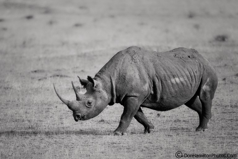
In the case of the black rhino from the northern Serengeti plains, the tan and green grasses along with the piles of dung didn’t offer any advantages or create a stronger image.
In the “Belly-Up” image depicting the circle of life, I’m able to isolate the subject allowing accentuation of the focal point, among the distracting ground clutter.

In the “Hyena Stare” – the ability to steer the viewer’s eyes directly to the hyena’s gaze.


In “Crossing the Road” one can clearly redirect the viewer to the elephants, vs the distracting brush. Note the skin patterns and textures that are enriched within gradients of grays.

Everyone has a personal style of shooting along with personal tastes for color vs. monochrome. I personally love the old “sepia” warmer tones in my images. Finally, as I archive and save my images to my print folder, I’m thinking about printing or maybe doing a tabletop book. Hahnemühle Fine Art Papers will be my go-to papers. I find them to be the finest papers available today, with a dependable product in each carefully packed box. Once one has their ICC profiles loaded and set into their Canon Printer history folder, they are good for consistent and reproducible prints! My ultimate printing paper choices for black and white images will be Hahnemühle FineArt Baryta Satin Paper & Hahnemühle Photo Rag® Ultra Smooth. I’ll also be using the Hahnemühle Red Stitch Leather Album as my choice for the tabletop books.
